Font Calatogue

Font Catalogue is Latinotype’s newest chapter. After more than 13 years shaping the typographic landscape in Latin America and beyond, they felt it was time for a fresh concept—one focused on offering fonts and custom type solutions built specifically for brands.

Font Catalogue brings together the best of both worlds: it acquires, distributes, and licenses typefaces from a wide range of designers, while also developing custom typography for brands that need something truly their own. Type for tech companies, independent restaurants, magazines, bold campaigns, and small creative projects that want to leave a lasting impression.

After winning the pitch, I led the development of the visual identity for the brand. I designed type specimens for Better Sans (their first release), created animations for social media, and designed their website. It was a particularly exciting challenge because, for the first time, my clients were type designers—people with deep technical knowledge and a strong perspective.

Three billboard posters on a brick wall for Font Catalogue. The left poster has a dark background with white and purple text about fonts for different purposes. The middle poster has a white background with bold red text stating, "Fonts built for bold ideas." The right poster has a dark background with purple and white text, including a logo and description about the catalogue's font offerings.
Four modern business cards arranged in a 2x2 grid on a black background, with various colors and text.

The process became a collaborative conversation, refining the logo and color palette together until we landed on a visual system that felt aligned and intentional.

Logo of Font Catalogue with a stylized icon and text on a light background.
Flat lay of branding materials including a black folder, a white card with red text and QR code, a purple gradient brochure titled 'Font Catalogue', a red pencil, and a black clipboard on a purple and black background.
Half of a logo with stylized purple and white letters F and C on a white background, and half showing a purple and black text graphic with the slogan 'Make it type. Make it matter.' and branding information on a black background.
A catalog titled 'Font Catalogue' with a gradient purple background, lying on a red surface, partially illuminated by a light source.
Billboard with dark gradient background displaying text about font collection and style, on a brick wall, with shadows of tree branches overhead.

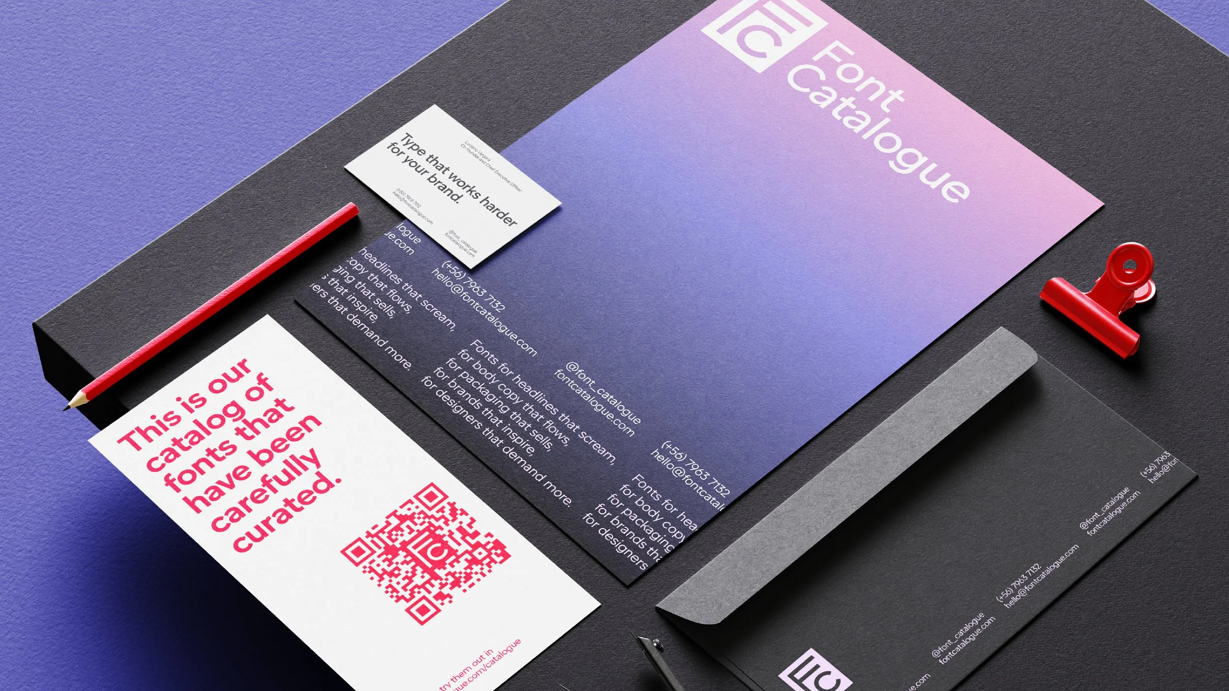
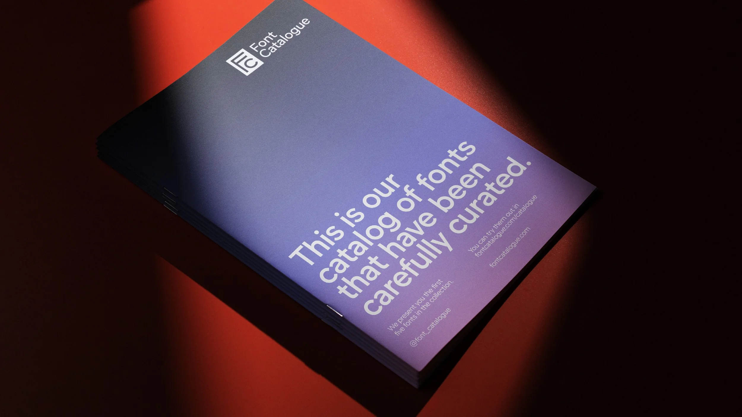
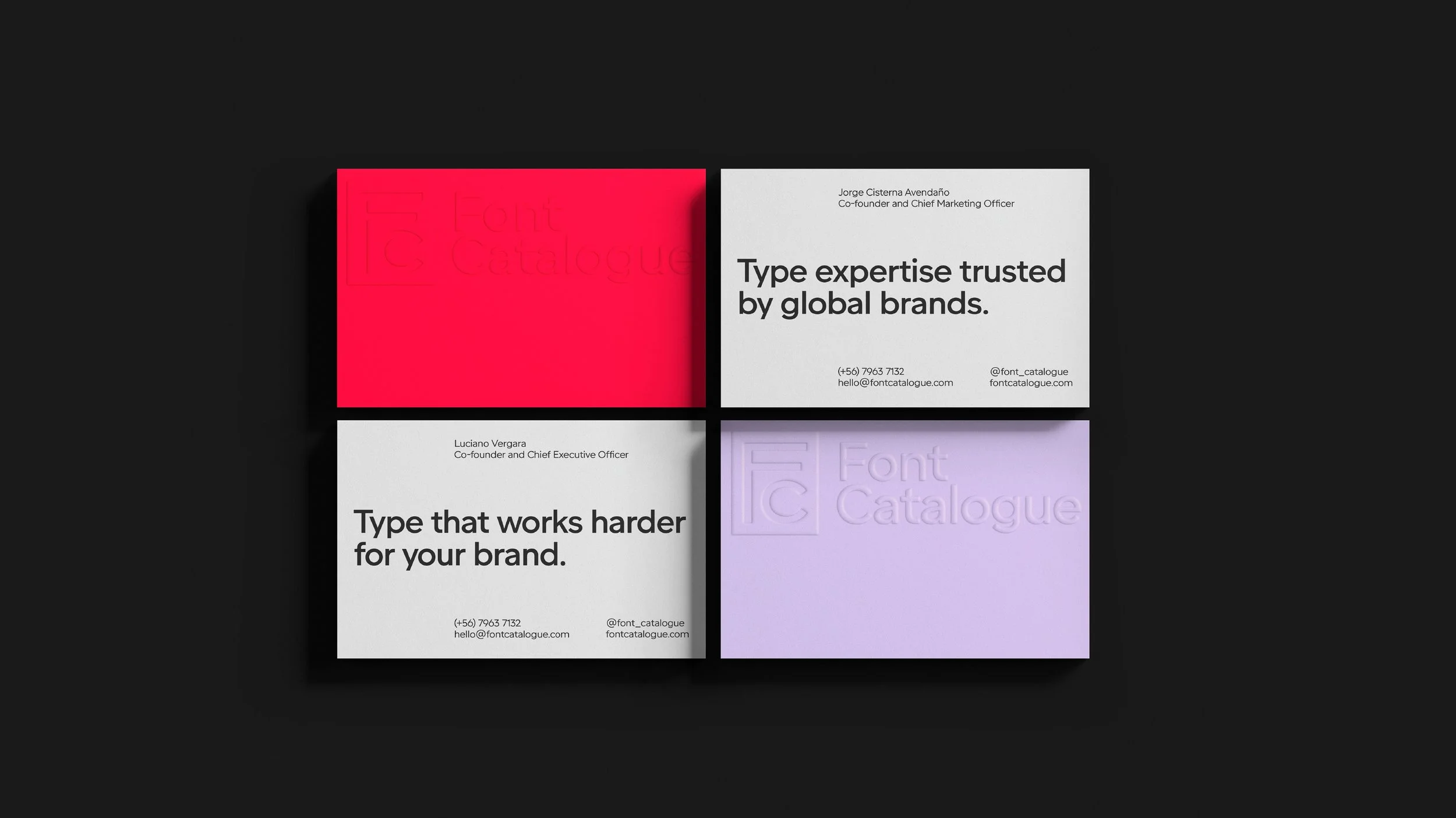
The visual universe extended into stationery, OOH concepts, and a printed publication to showcase their typefaces at talks and typographic festivals.

You can explore their catalog and discover their first releases on their new website.

Image of a spiral-bound notebook with numerous sketches and designs of various 'FC' logos, with a grid of different stylized logo icons displayed to the right.