INNK
INNK is a collaborative platform that enables efficient management of ideas and projects, helping companies build a stronger culture of innovation.
After being referred for my work and winning the project bid, the INNK partners tasked me with rebranding the company. They needed a visual identity that could better communicate with both their users and the decision-makers purchasing the software. Although the product itself is contemporary and fully developed in-house — something still relatively uncommon in Latin America — their existing visual identity felt outdated, leaning more toward early–2000s aesthetics rather than reflecting the modern functionality they offer.
After several rounds of concept development exploring themes of growth, progress, collaboration, and idea generation, we arrived at a logo that represents collective advancement — the kind of forward movement that happens when companies grow through well-executed projects driven by their own teams. The goal was to support digital transformation processes through innovation, in a way that looked current yet direct, especially because the name “INNK” doesn’t inherently reveal what the product does. The idea was to highlight the platform itself: a customizable tool that allows companies to track each idea from its initial proposal all the way to implementation as a full project, accelerating timelines and strengthening collaboration between teams.


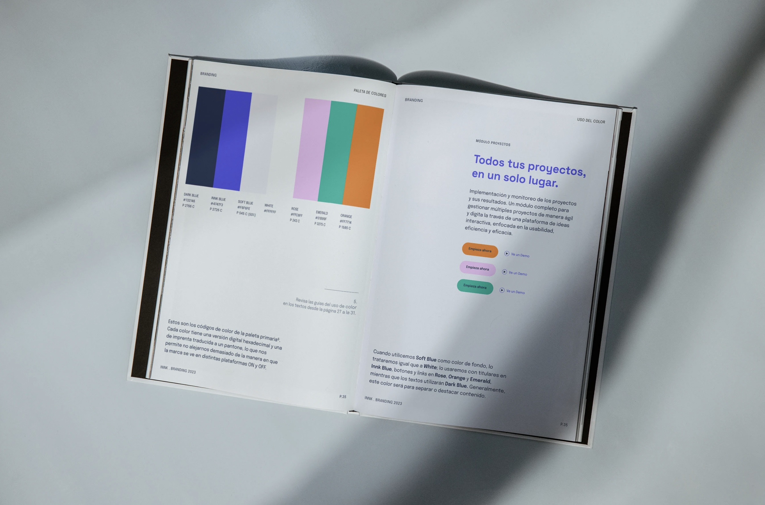
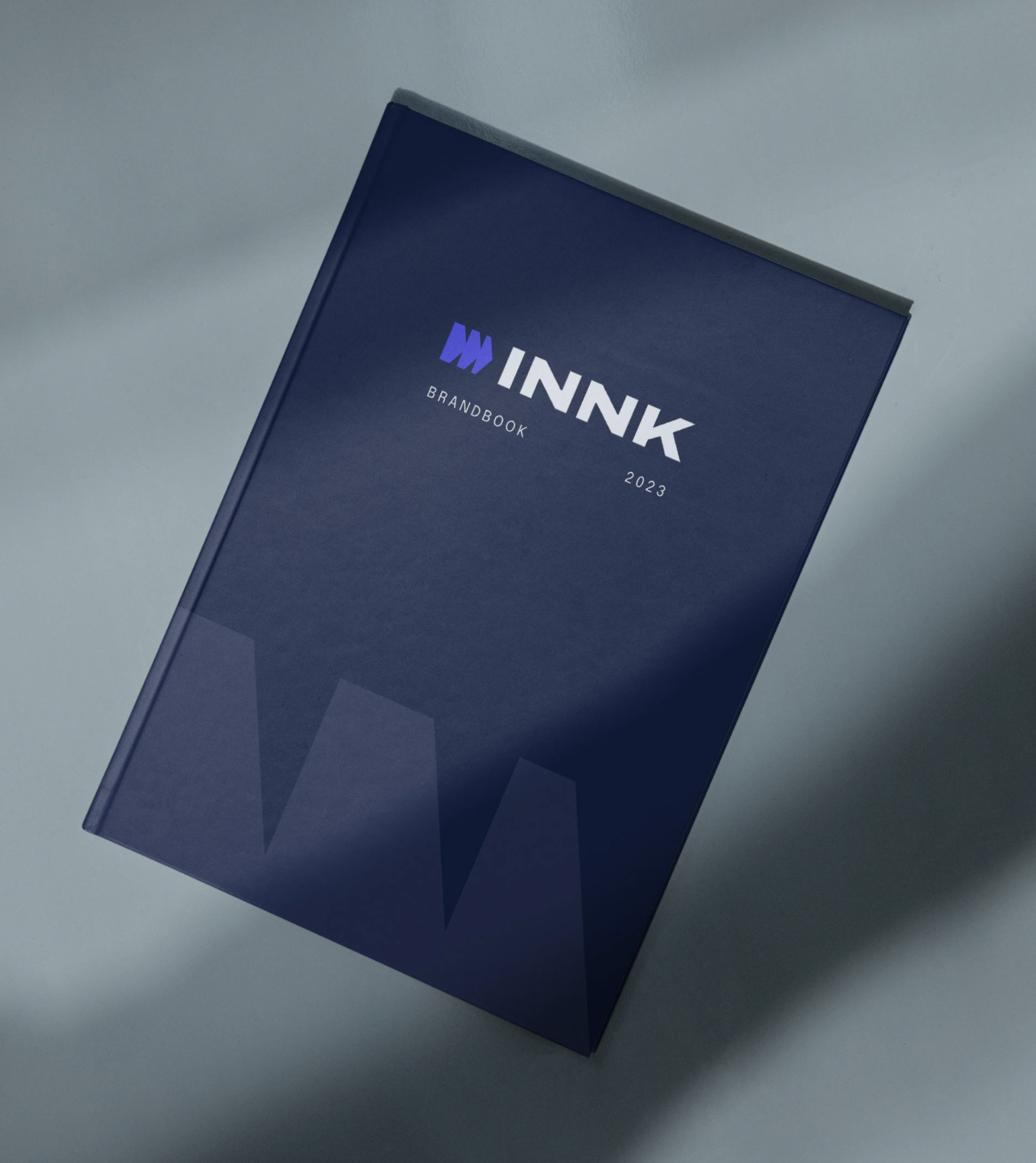
A key part of the brief was ensuring that the brand looked modern and competitive in the regional landscape, while also positioning it for future expansion into U.S. and European markets. For that reason, the rebrand required a complete reset: a new color palette with more digitally-oriented tones, a geometric typeface that conveyed clarity and seriousness, and a clean, flexible graphic system. Since their in-house design team was still developing, it was crucial to create a system they could apply with ease — so producing a brandbook and detailed brand guidelines became a central part of the scope.


Once the new identity and brand guidelines were established, the next priority was redesigning the website so it reflected the quality of the product. We restructured the previous site entirely and designed a new one aligned with interface and interaction standards familiar to users of similar software, helping reduce friction and streamline onboarding.

Eventually, the rebrand led them to update the software itself so it could align with the new visual identity. They applied many of the same brand guidelines to the platform — including the color palette, typography, and overall look and feel. As a starting point for this process, I helped them redesign the platform’s login screen, along with a few secondary interface screens that served as a visual and structural reference for the rest of the product.
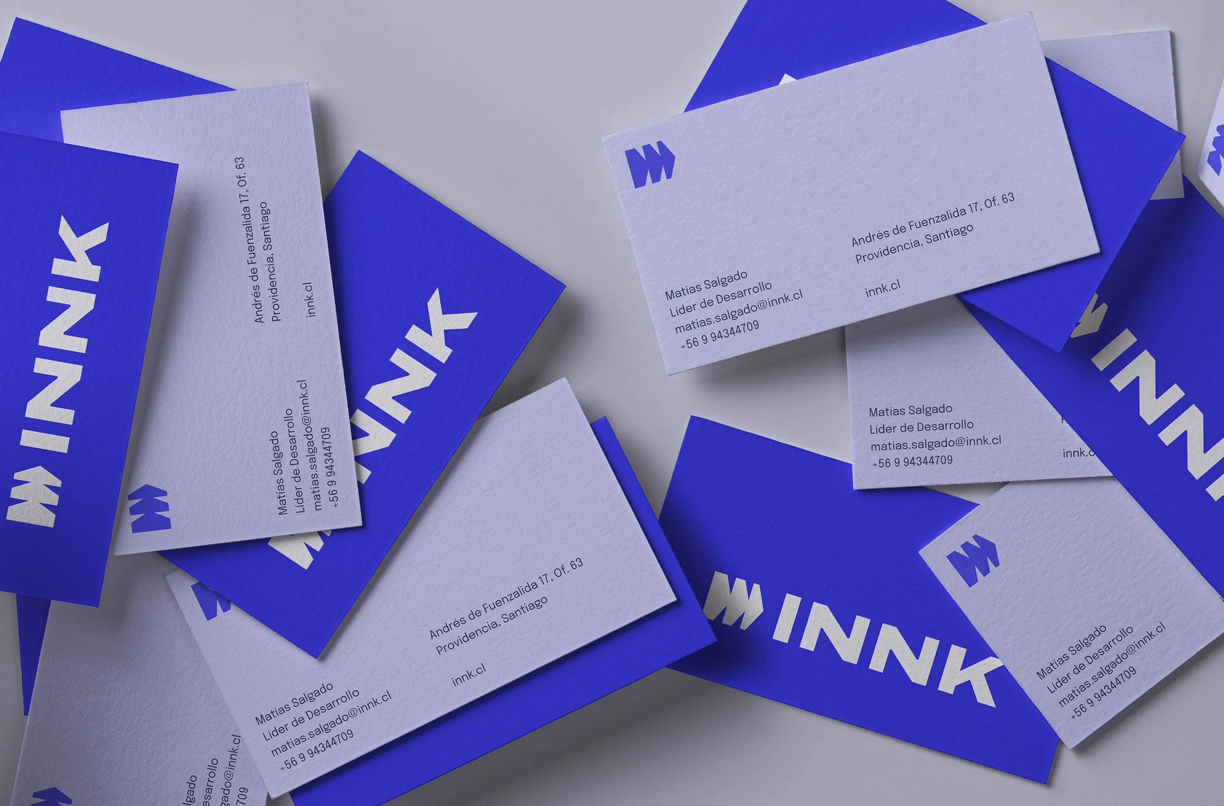

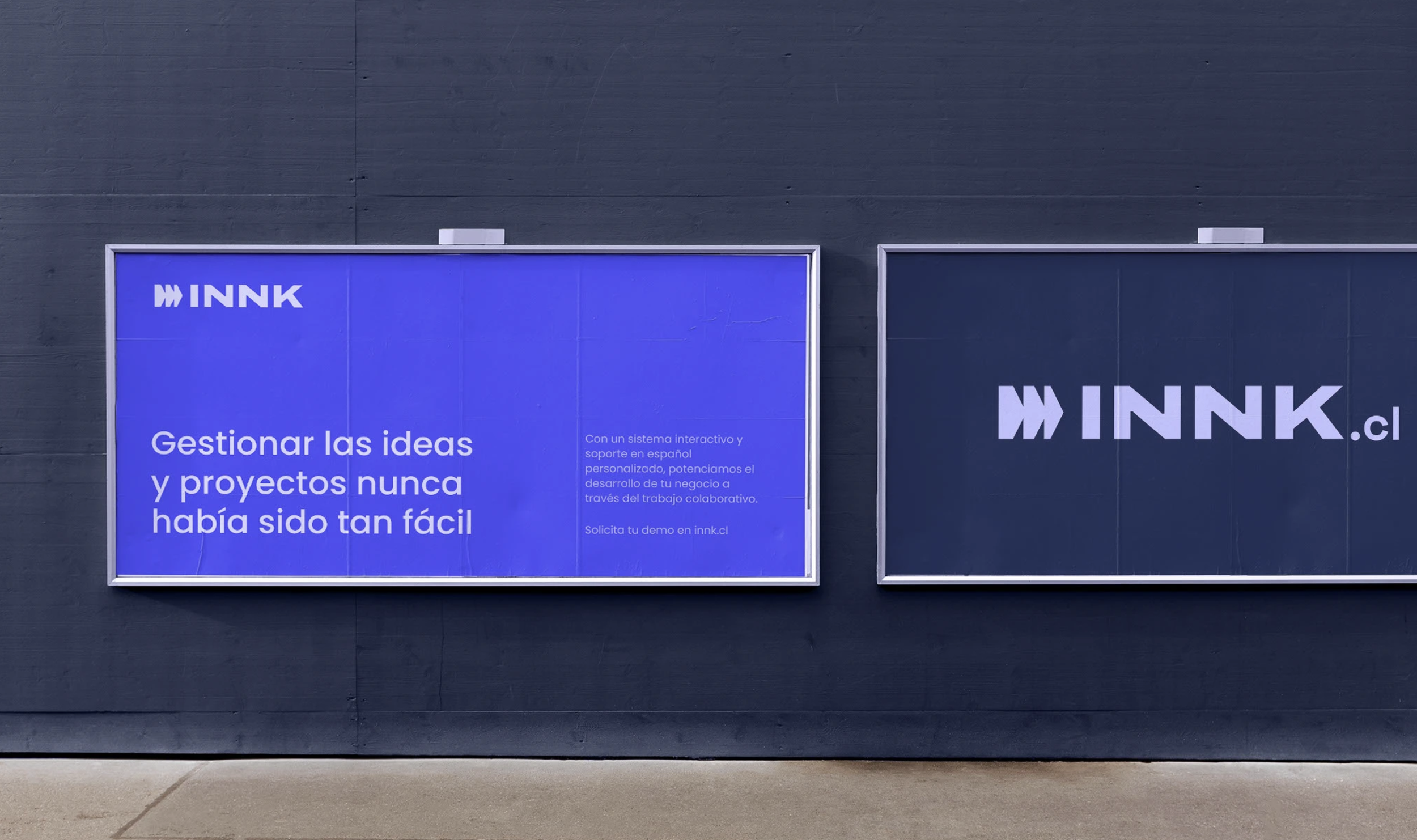
Finally, to support the transition and internal implementation of the brand, I designed additional collateral including OOH pieces, print materials, and social media templates. Because the company handles all their communications internally — without an external design or advertising agency — it was essential to empower their team to carry the brand forward. For that, I conducted training workshops to guide them through applying the new visual system across different touchpoints.
