Madreselva
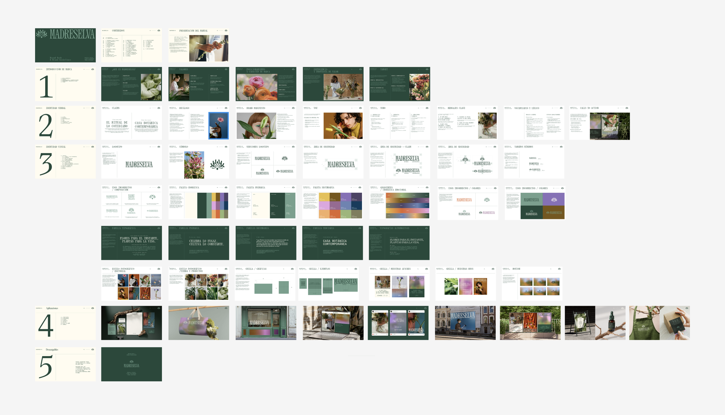
Madreselva was developed within the Visual Identity Creation and Brandbook & Brand Guidelines modules of the Master’s in Brand Strategy and Identity at SHIFTA (by Elisava), which I am currently completing this year. The project challenged me to build a brand from the ground up: strategic foundation, creative concept, visual and verbal identity, and a complete system of applications.
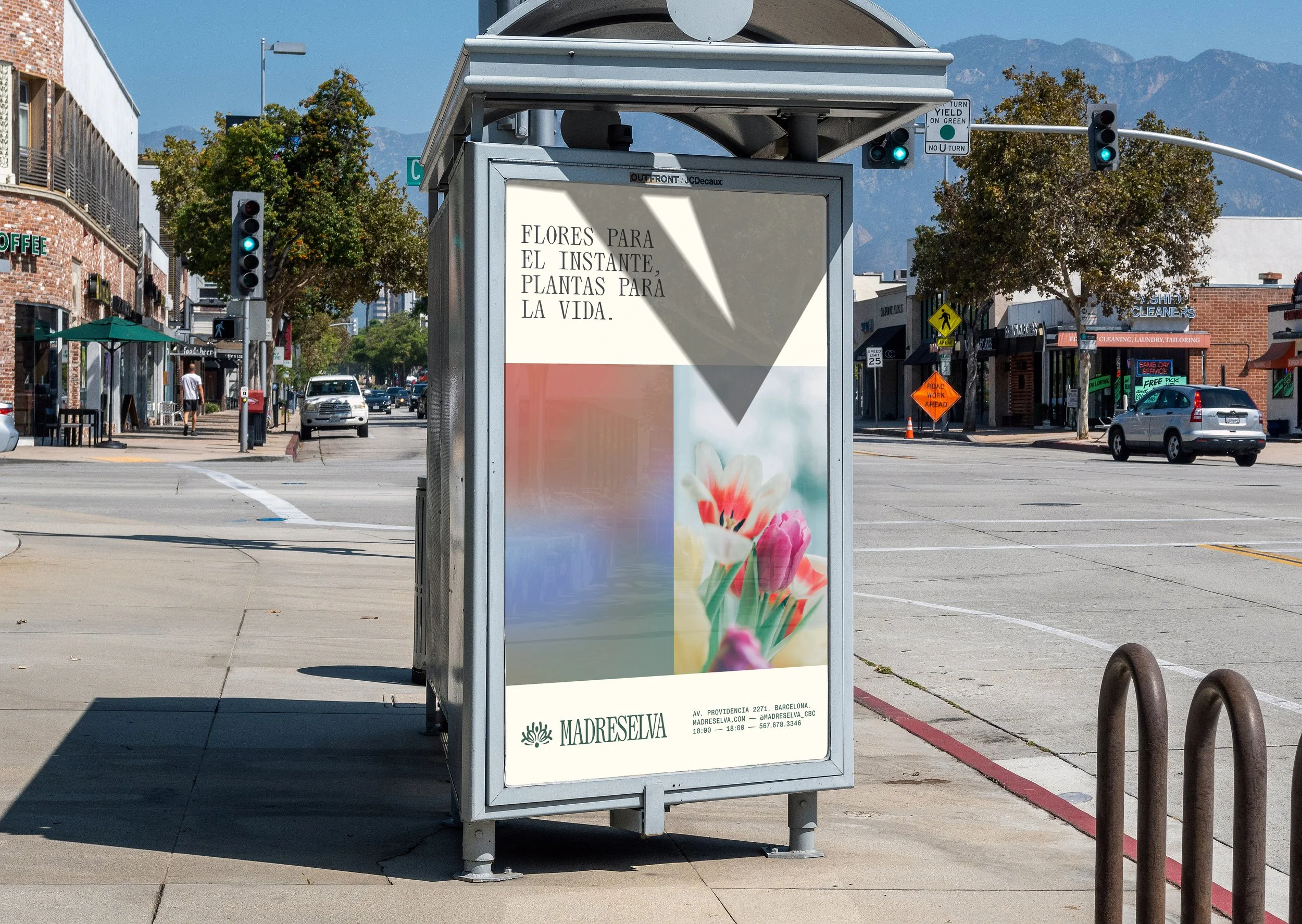
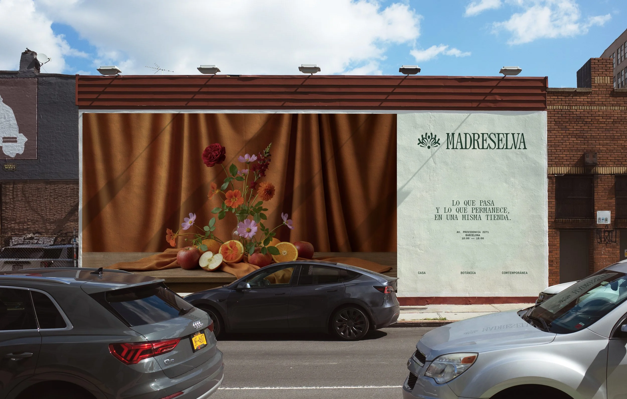
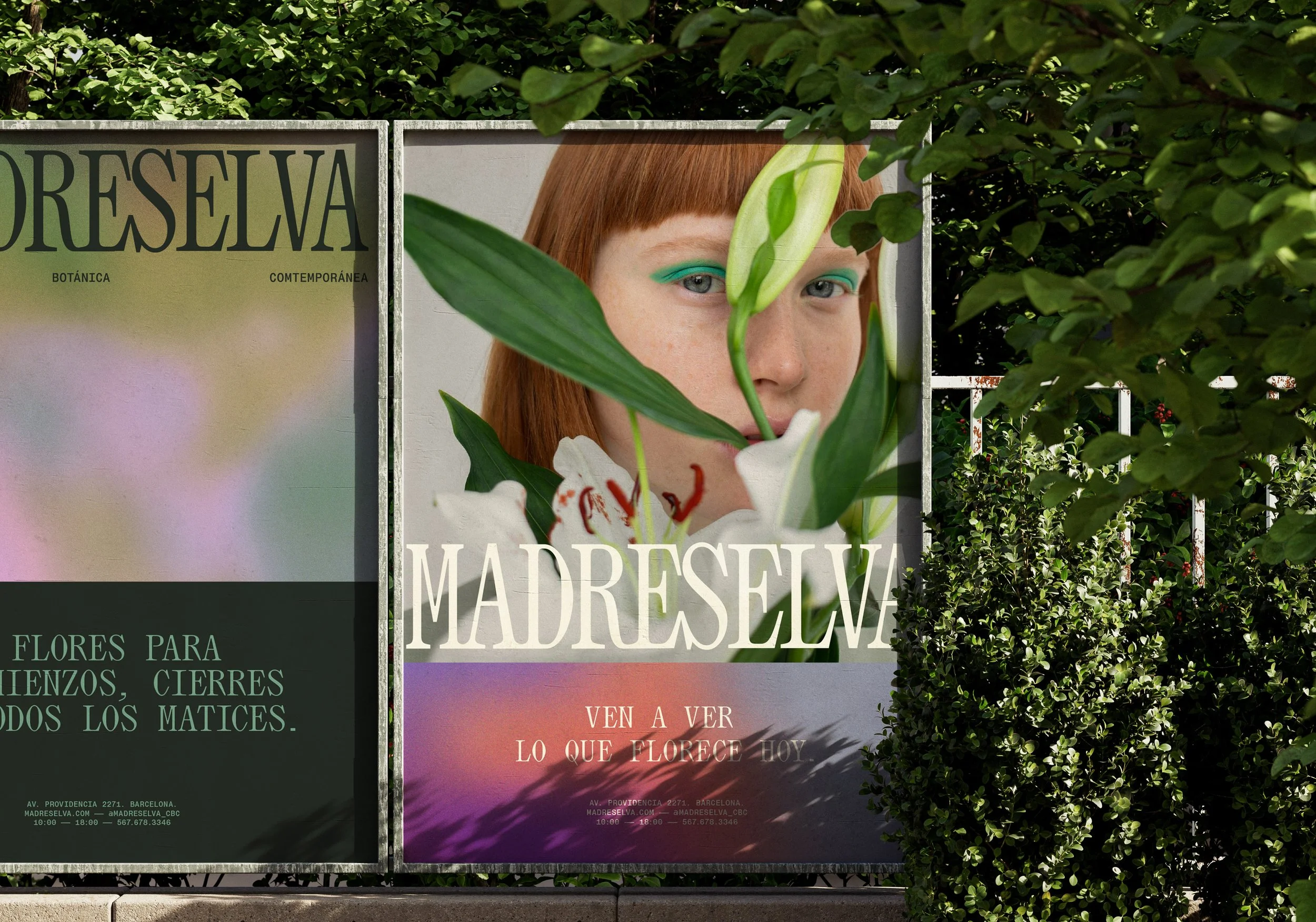
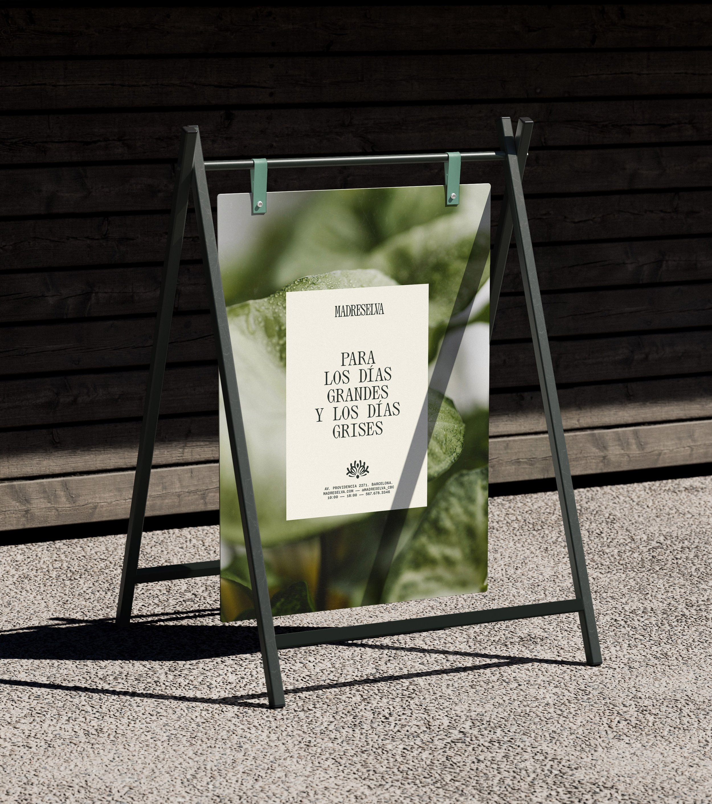
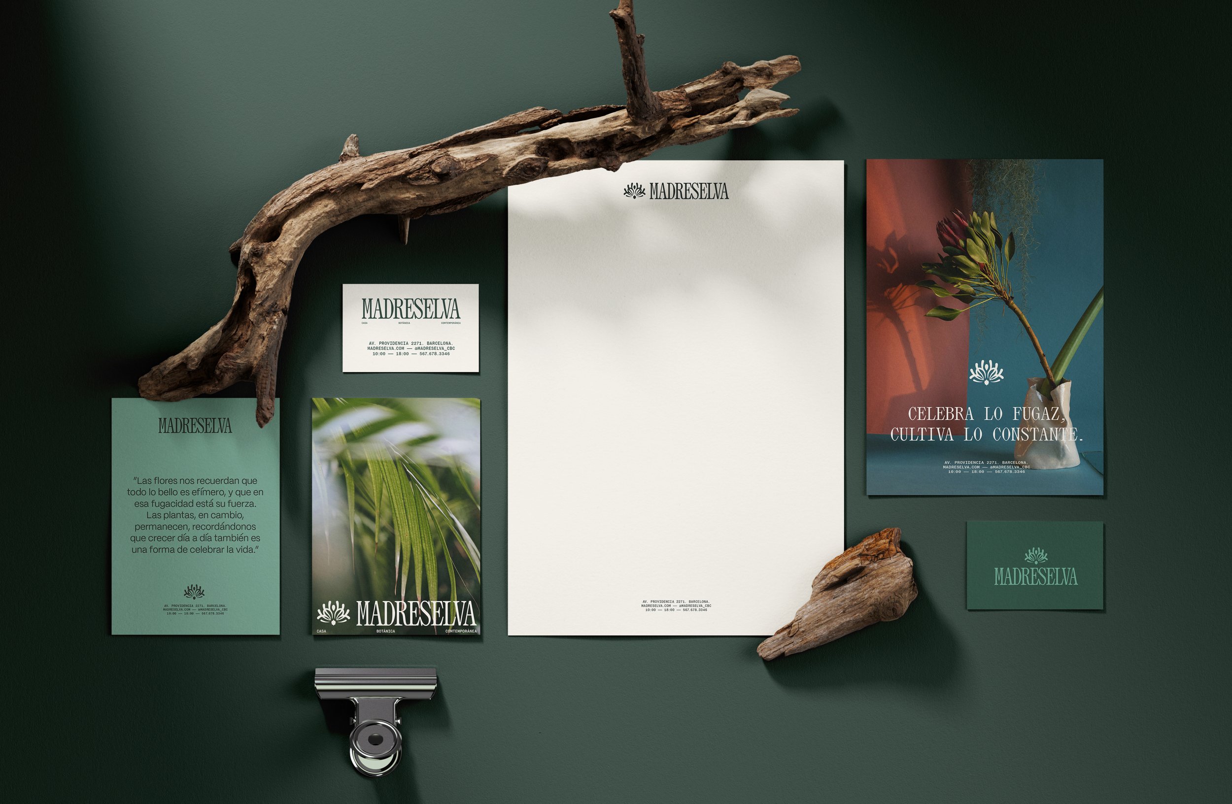
The idea of a Contemporary Botanical House (Casa Botánica Contemporánea) shaped the entire narrative. Envisioned Madreselva as a place where flowers and plants aren’t merely products, but companions. Flowers, with their fleeting beauty, mark the moments that pass quickly—celebrations, gestures, beginnings, and farewells. Plants represent the opposite rhythm: permanence, care, and everyday presence. This tension between what is ephemeral and what endures became the spine of the brand.
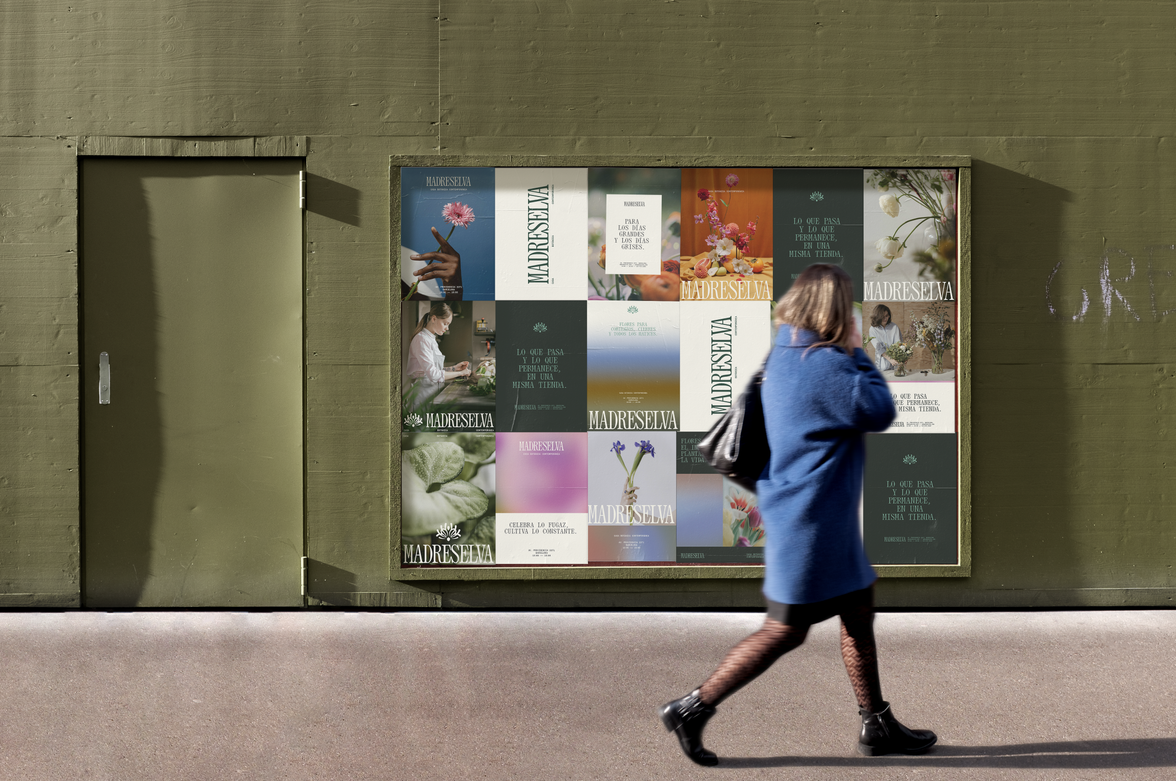
Beyond the core identity, I designed the full set of collateral materials: packaging, labels, wrapping systems, stationery, and store products that extend the brand into everyday interactions. Each touchpoint was crafted to feel like part of a ritual—something that begins in the shop but continues as flowers or plants become part of someone’s home.
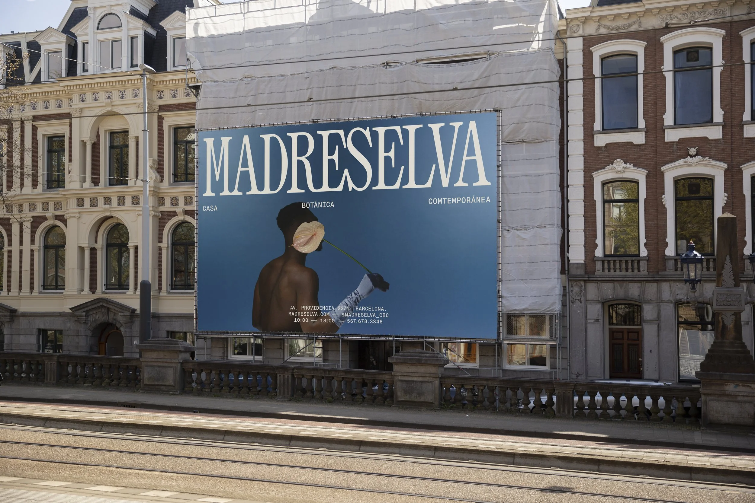
Visually, Madreselva unfolds through editorial-style photography that treats botanical life with intimacy and refinement. This approach positions the brand in a space between a fashion editorial and a botanical journal, elevating the ordinary into something contemplative and expressive.
THE SYMBOL
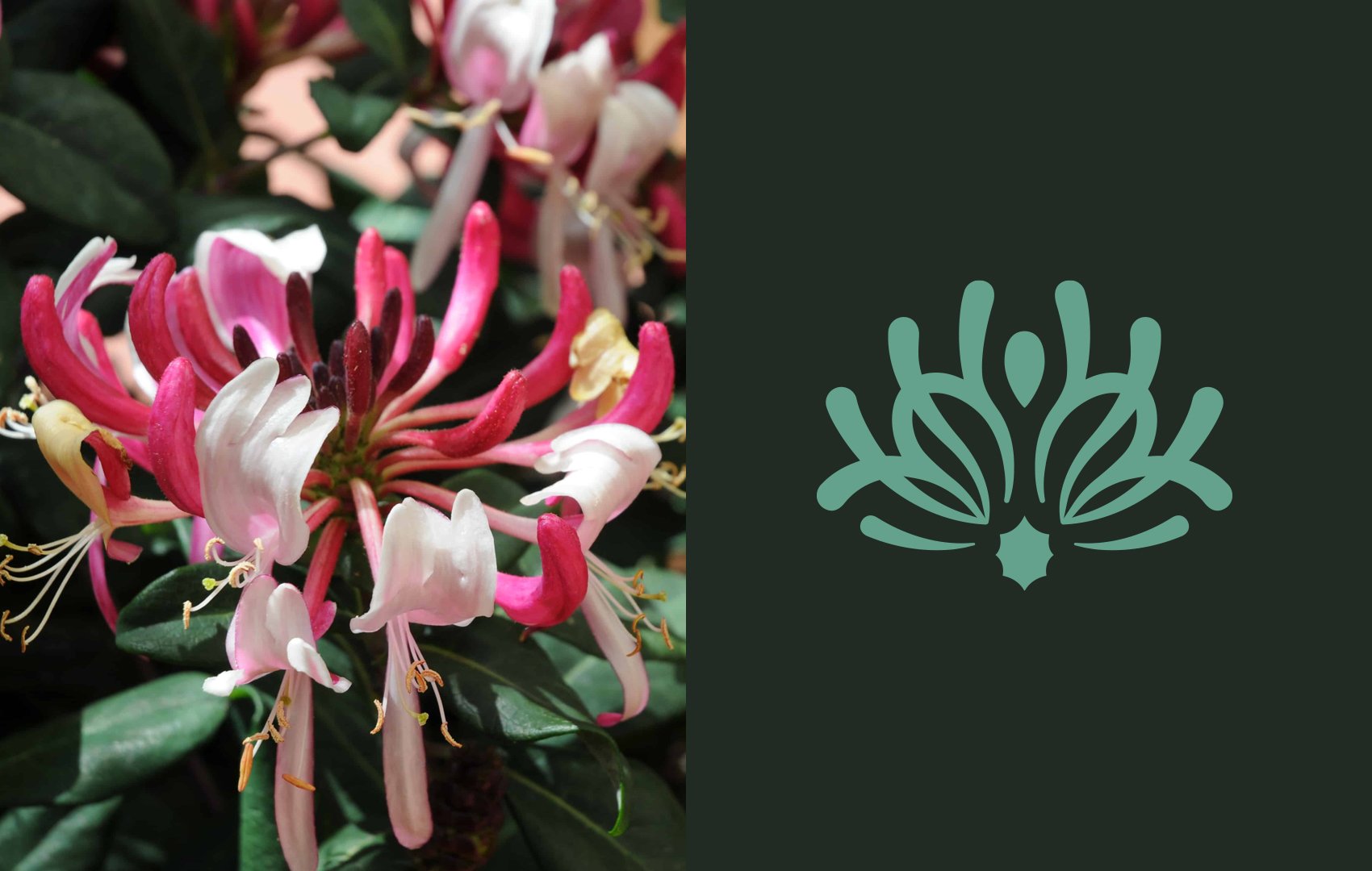
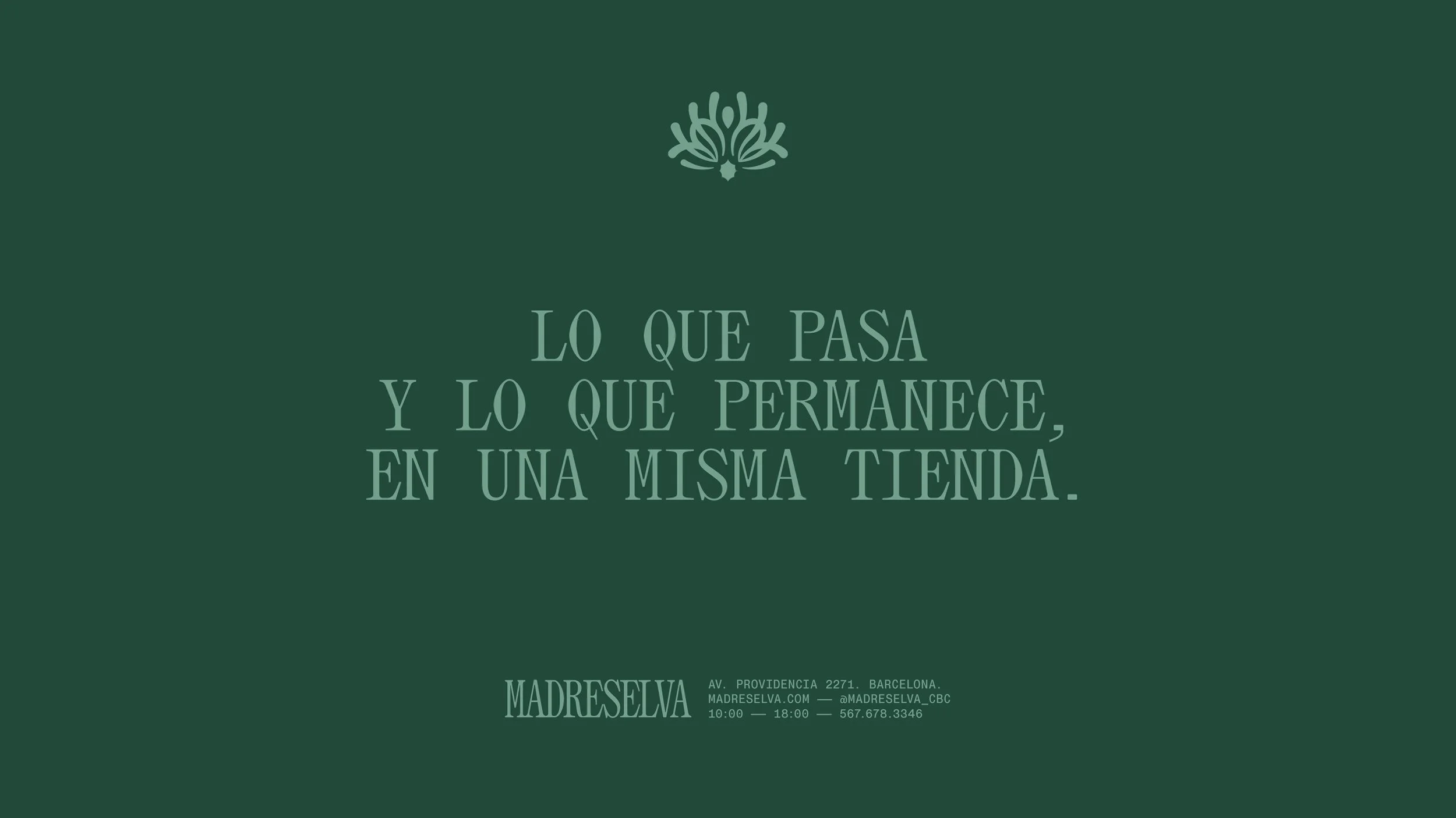
The isotype takes its inspiration from the honeysuckle flower—Madreselva’s namesake—but reimagines it through a symmetrical, more intentional lens. Rather than drawing it literally, I distilled its forms into a balanced symbol that feels both organic and constructed. The symmetry reflects the brand’s core tension between the ephemeral and the enduring: a flower that lasts only a moment transformed into a lasting emblem. It becomes a quiet metaphor for the brand itself—rooted in nature, shaped by emotion, and refined into a contemporary mark.
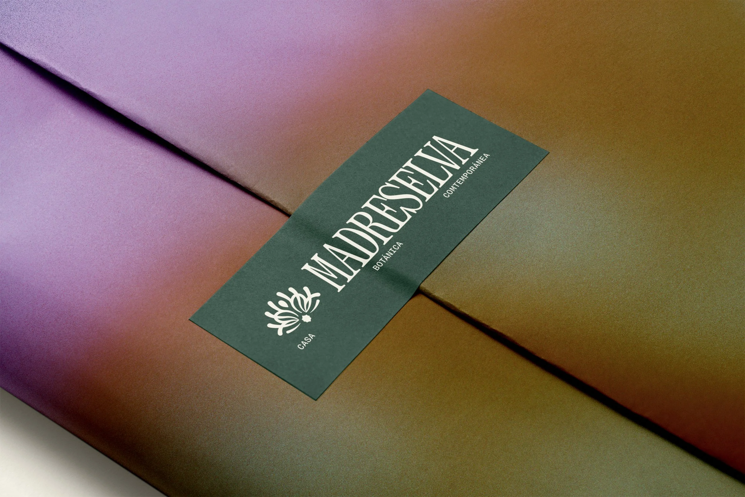

Color became the emotional language of the identity. A gradient-based system represents transitions between feelings, states of mind, and moments in life. Each gradient blends hues that evoke celebration, calm, nostalgia, or reflection. These shifting colors embody the ephemeral nature of flowers and the emotional complexity they carry.
To balance this fluid chromatic world, the typography draws inspiration from contemporary fashion magazines: elegant, structured, and editorial. It works as the visual anchor of the brand, a constant voice that contrasts with the emotional and ever-changing color system.
Madreselva ultimately explores the idea that life is shaped by both fleeting moments and quiet daily rhythms. It is a brand where color expresses emotion, photography captures subtle truths, and every botanical gesture—big or small—has the power to mark a meaningful moment in time.